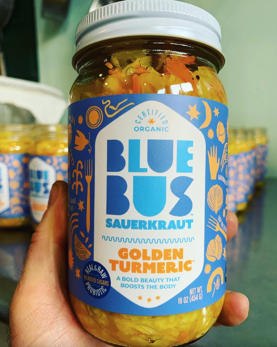
Blue Bus Cultured Foods
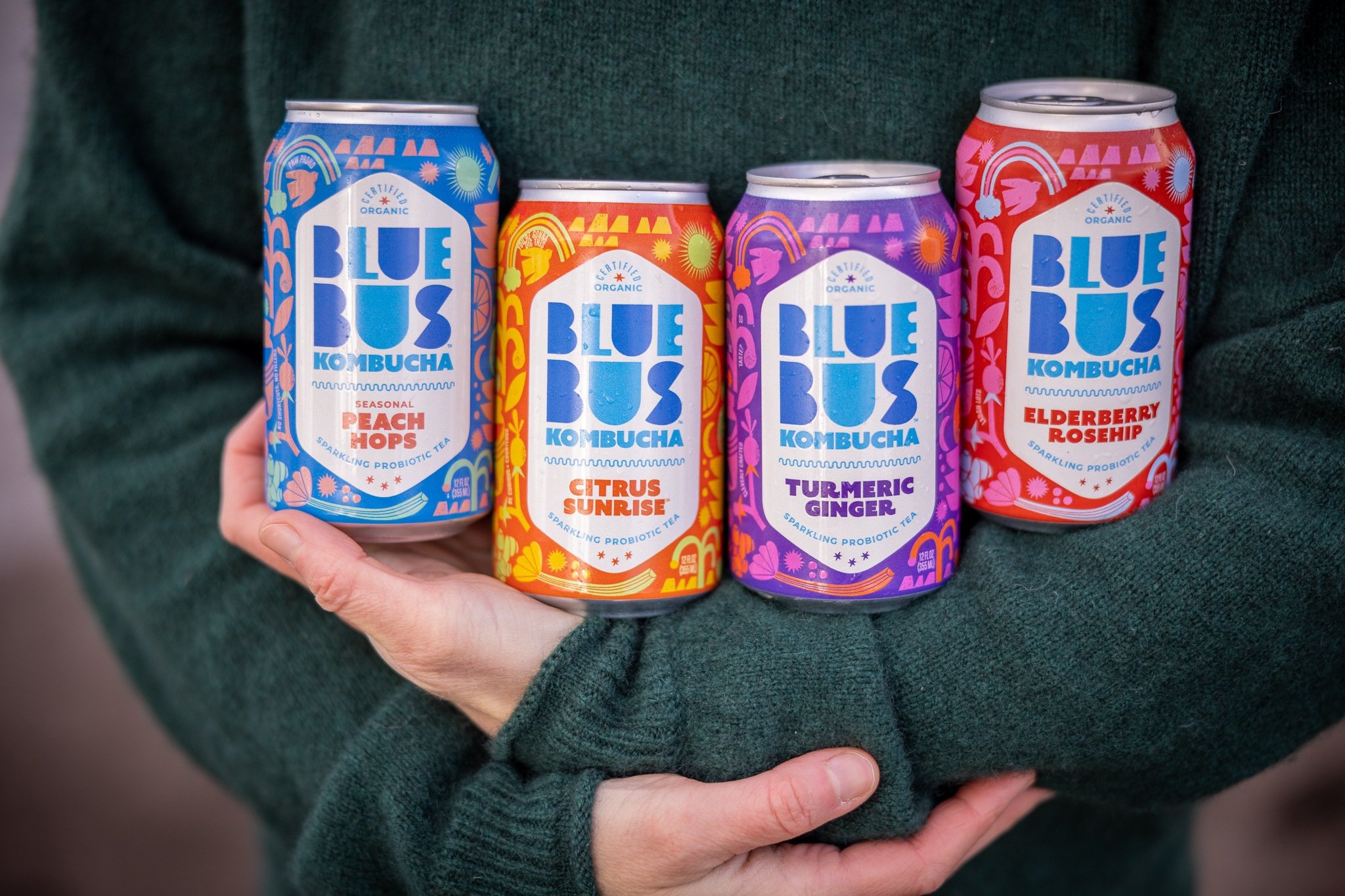
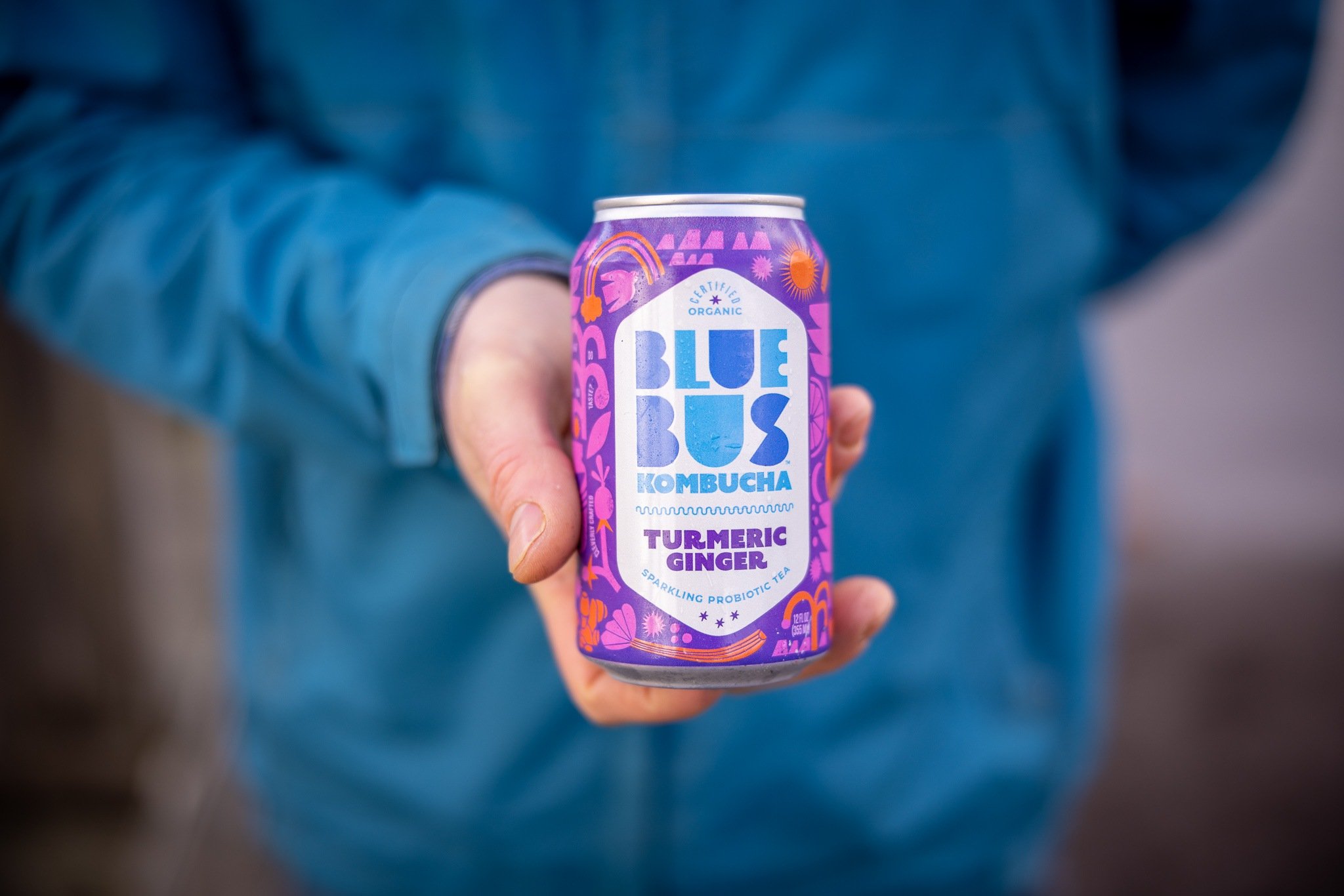
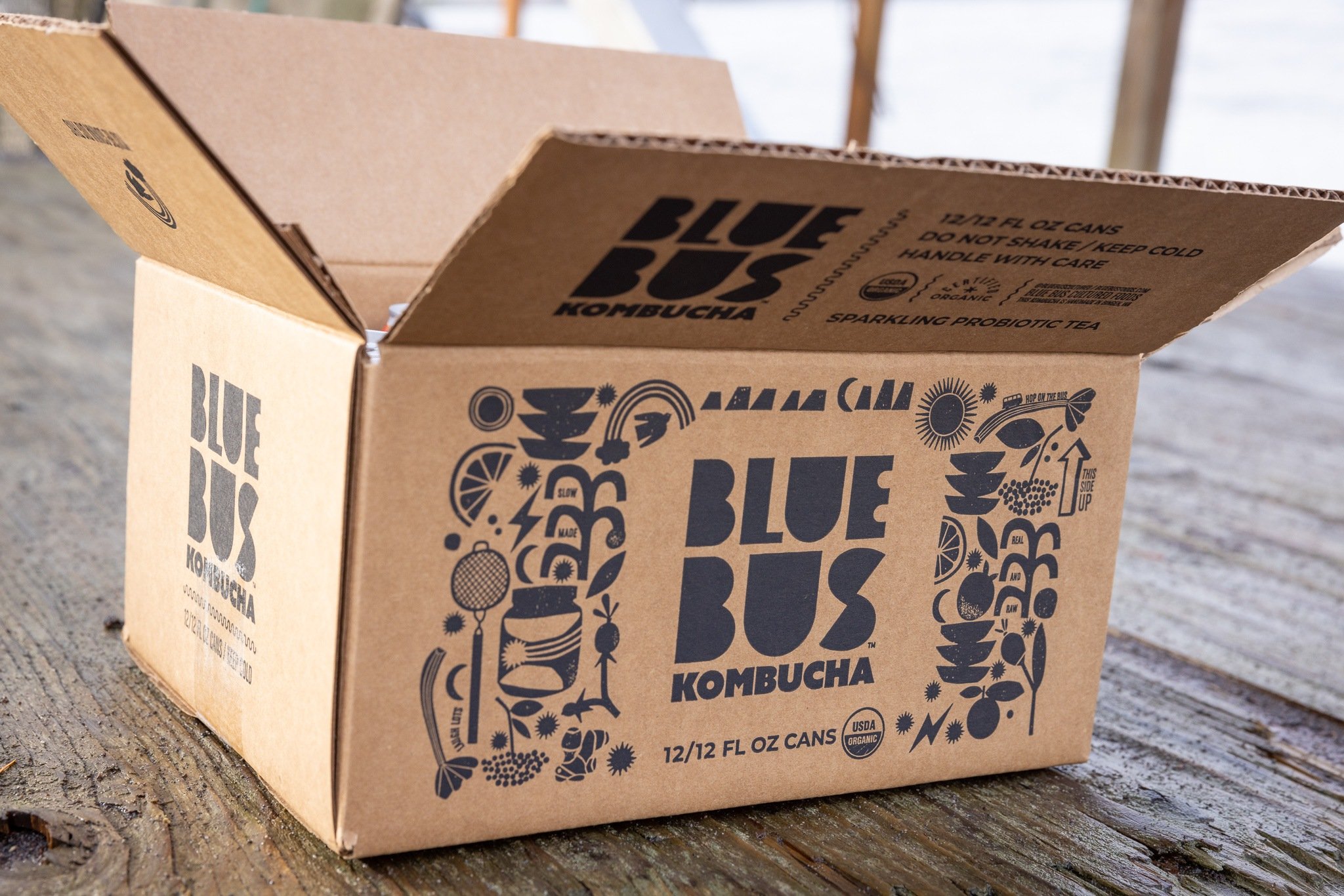
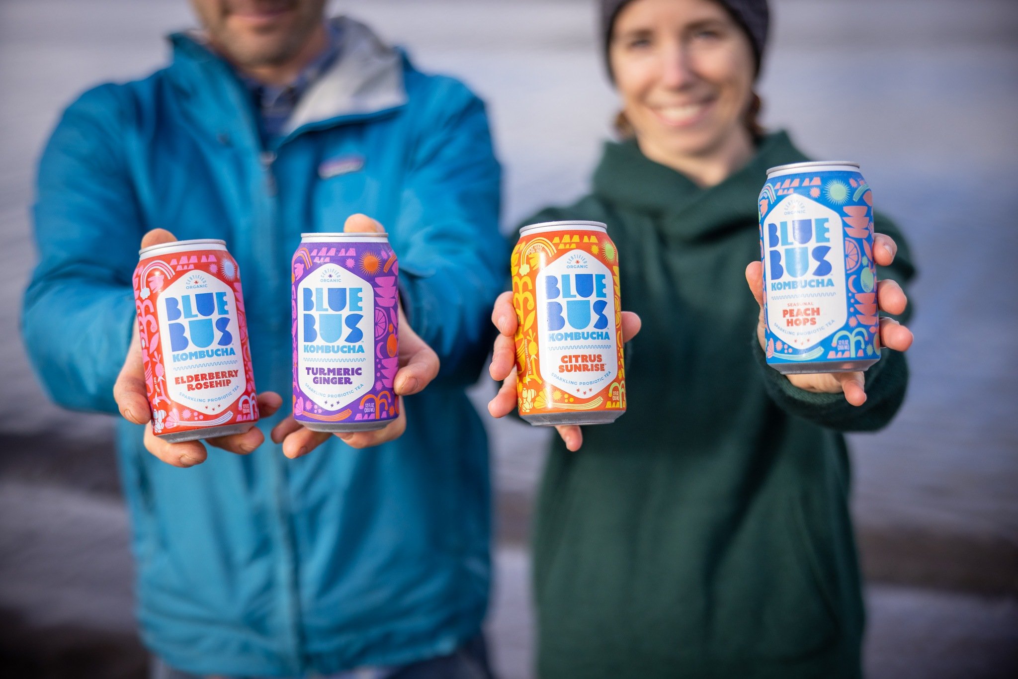
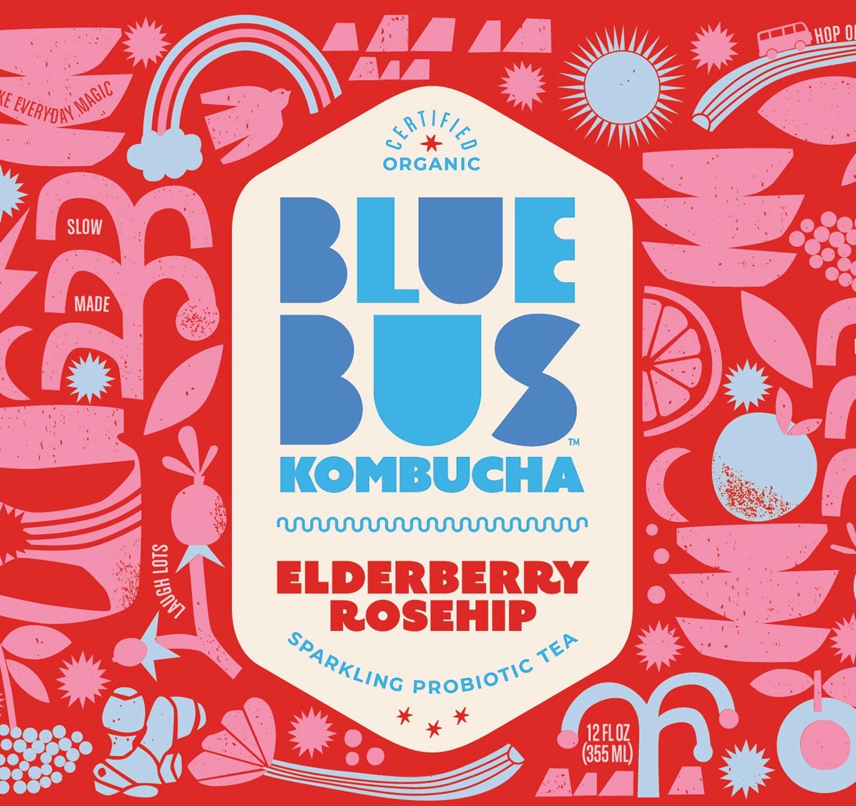
Make Everyday Magic. That’s the mantra at Blue Bus World HQ, where only real-deal flavors will do. We included in the design strategy: add joy and a strong contemporary sophistication to stand out on the shelf amongst the ever-growing Kombucha product packaging. Unique color palettes were created for each of the flavors, working closely with our client to connect flavor and taste cues.
The design reflects the origin story of Blue Bus, with illustration that includes an eclectic mix of ingredients, fermentation vessels and a happy mix of sunshine and earth elements. Each package has engaging storytelling–copywriting that is unique to every flavor.


Testimonial→
Your team did a great job of trying to understand what we wanted and did not want. What a huge task! We were really impressed at the amount of background knowledge you all came to the table with, and your level of professionalism. You were willing and able to hear feedback as a way forward, not a frustration. Thank you for taking all of our endless comments and ideas and making them into something joyful and magical.
–Kristin and Colin

Result→
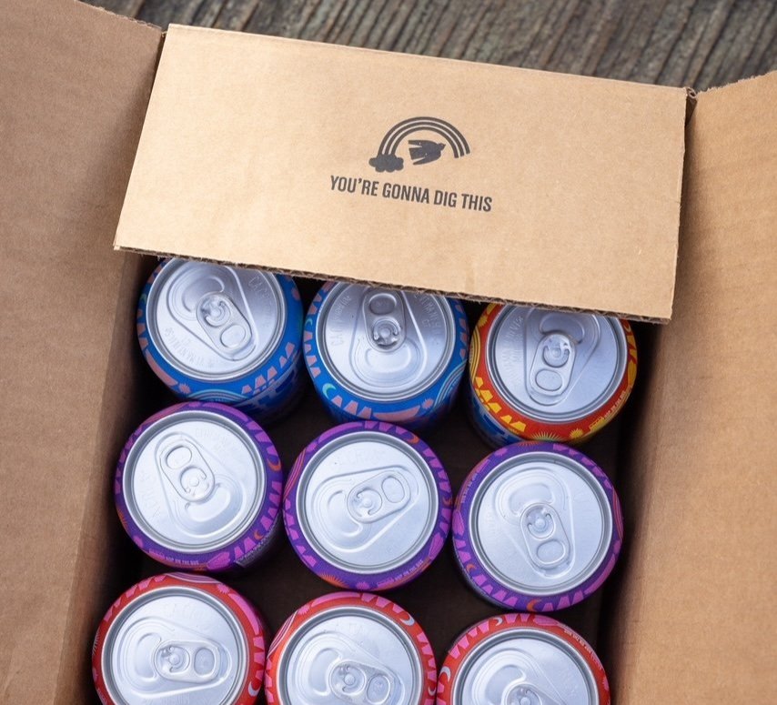
The new brand identity combined with packaging that visually pops off the shelf, and most importantly, connects you with a natural foods brand that produces honestly sourced and made products–never rushed, always real.
Blue Bus Kombucha is now positioned for growth. This brand now has an honest expression of their intent…packaging that presents the new Blue Bus vision for bold and wild kombucha and veggie ferments crafted in the heart of the Columbia River Gorge.