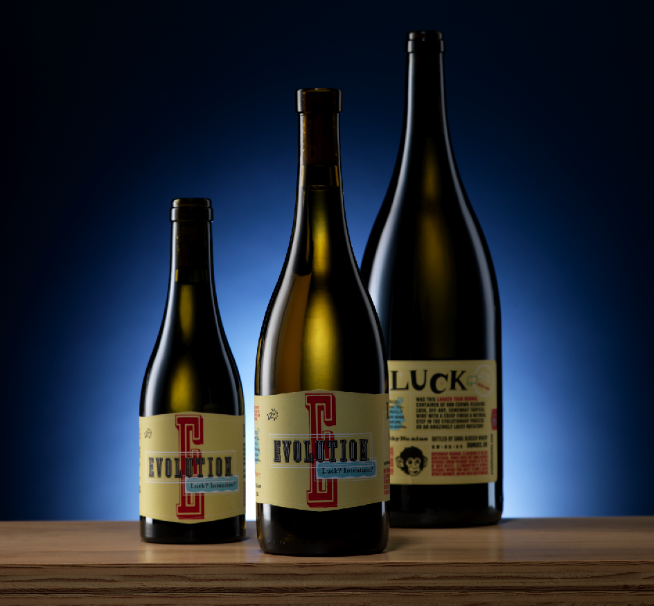
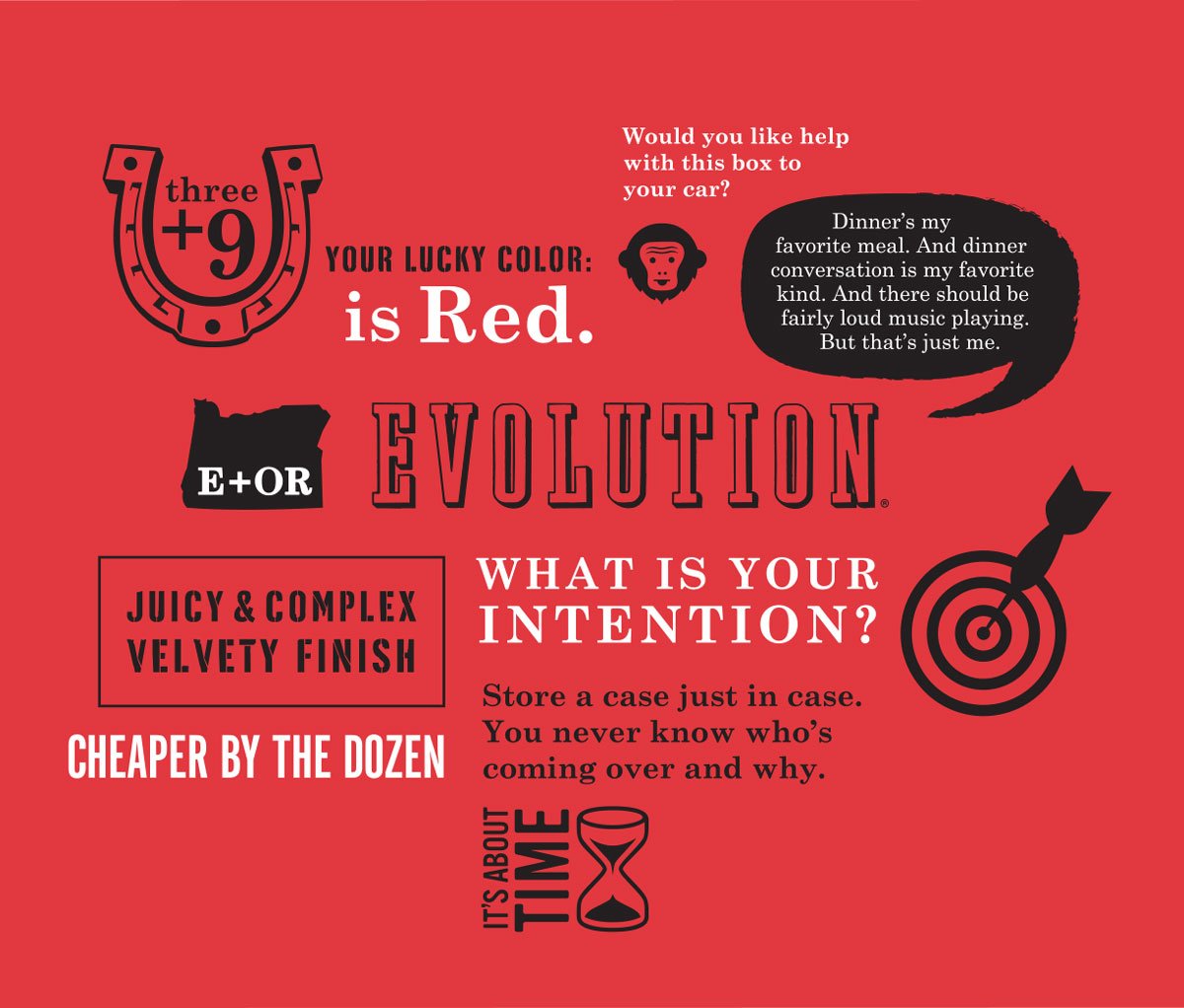
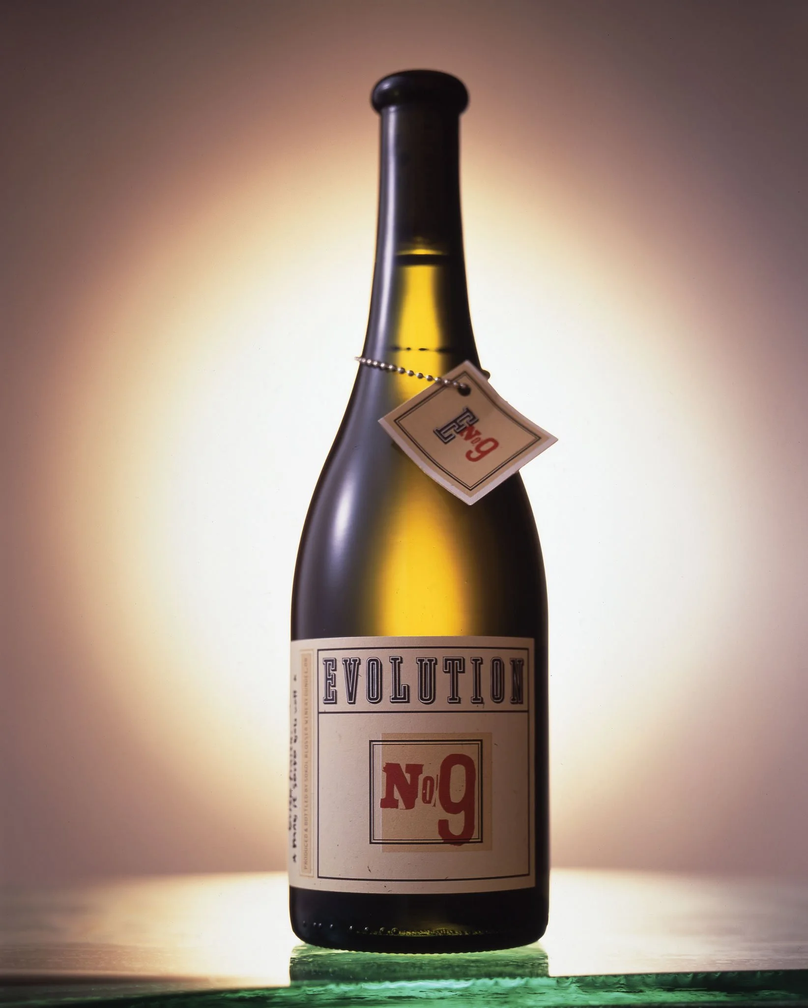
Evolution Wine
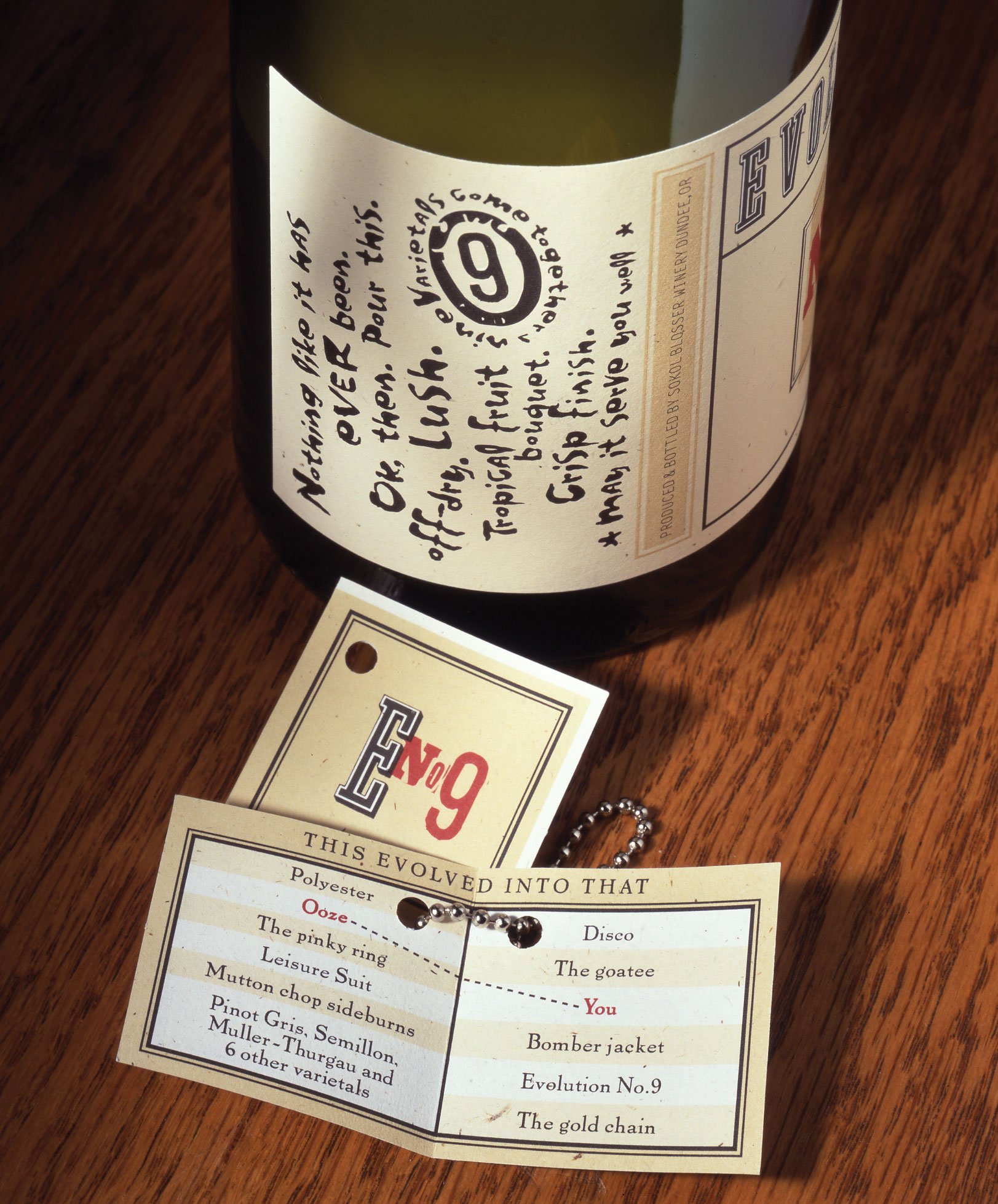
Sokol Blosser developed a white wine blend as a new niche in the market and as a way to use an excess of white wine grapes. We developed this new concept as a subbrand, named Evolution No. 9, and designed a packaging system that was fun, approachable, and friendly. The name evolved over the years to a more succinct ‘Evolution’ and an ethos that wine labels and witty branding could be a delightful part of your wine-drinking experience.
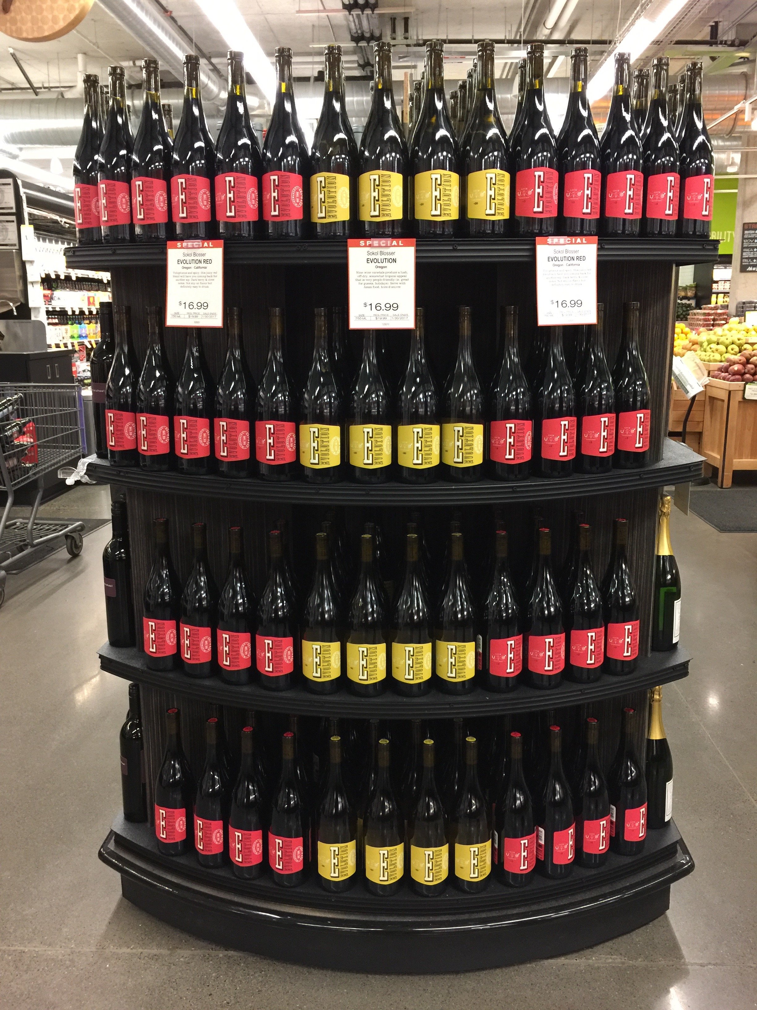
Over a period of 20 years, our partnership created groundbreaking design and soaring sales.


Opportunity→
By combining the juice from all of their less expensive varieties, and creating a pleasant-tasting “lifestyle” wine, they increased profits and awareness almost immediately. True to its name, the label has evolved as the product continued to grow in the marketplace.


Result→
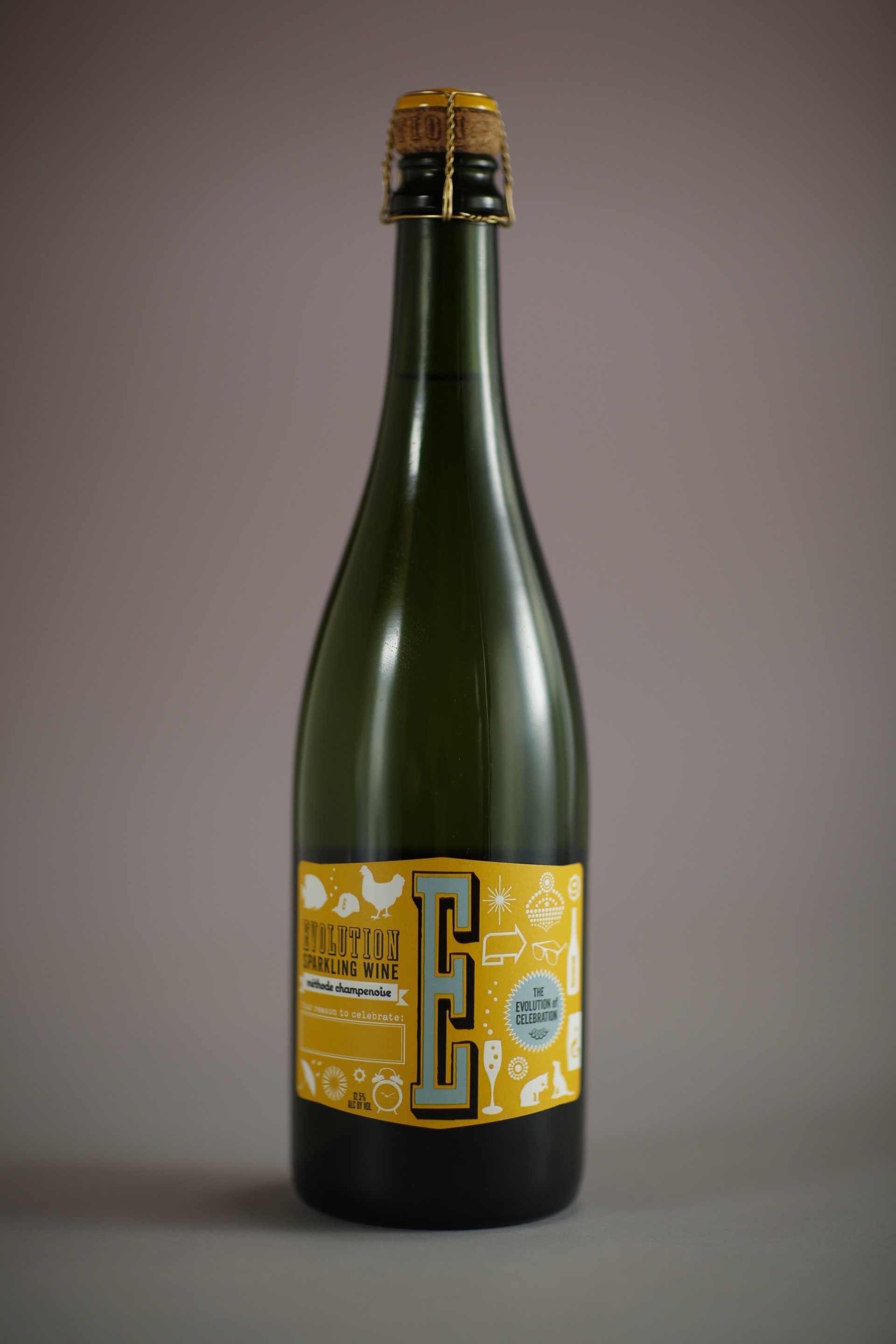
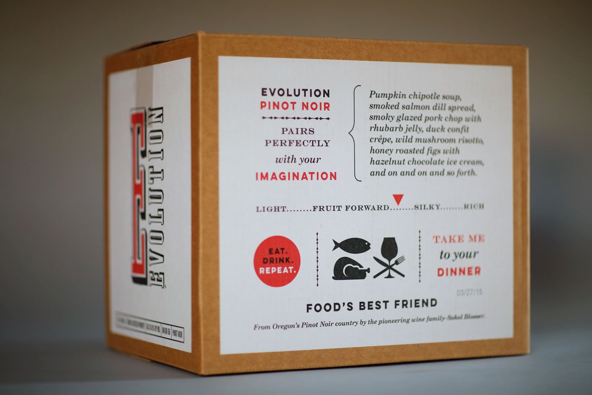
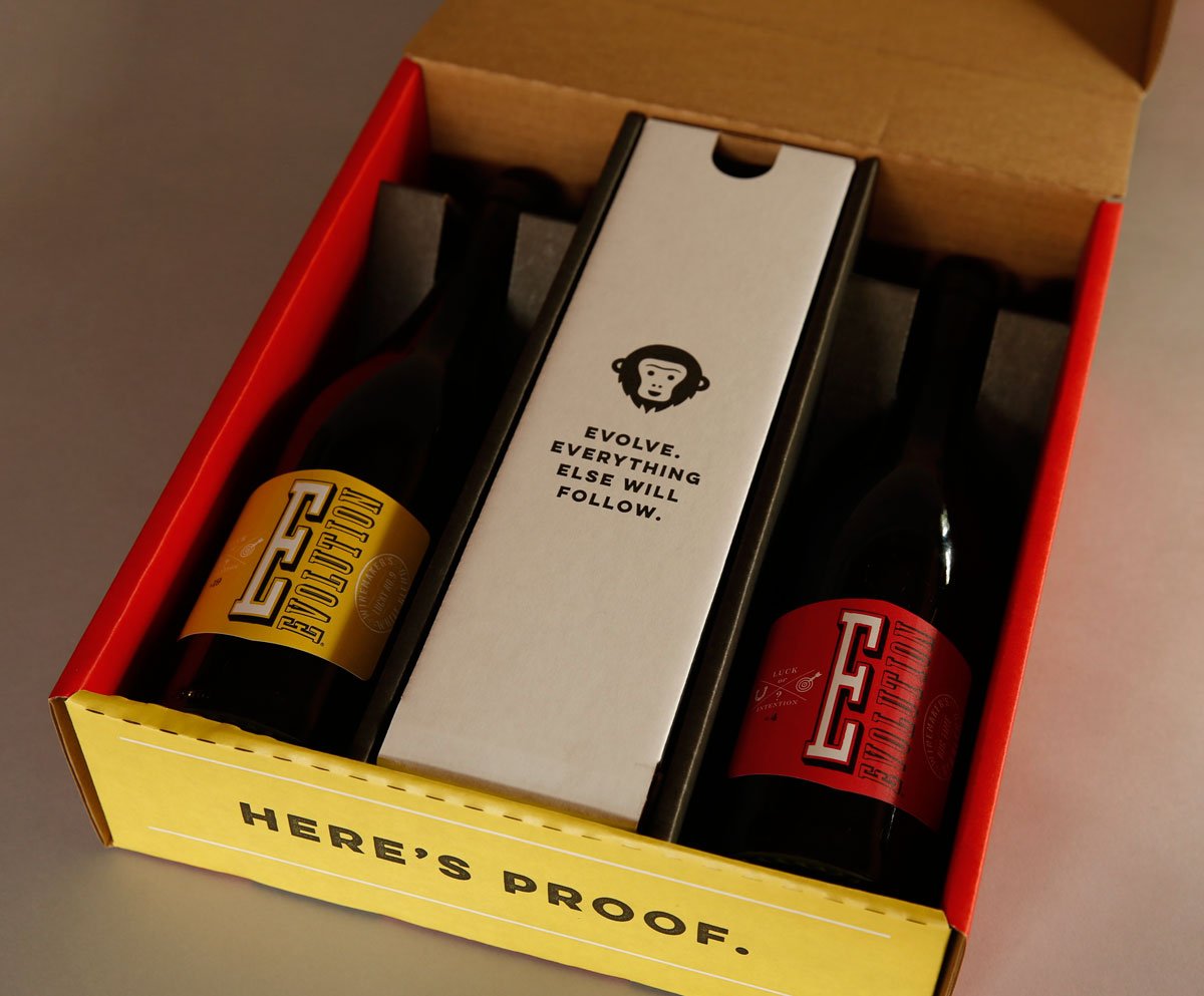
Twenty years later, our re-branding goal for Evolution was to evolve the brand packaging. We married a new, distinctive packaging design with the joyful articulation of “Fun and Good Times” – a product that people enjoy on every occasion. The bold "E" remained prominently integrated on the front labels along with the brighter color palette which preserved Evolution's brand equity and recognition.